Add Breathing Space in Design to Reduce Anxiety
This post will take around 3 minutes to read
Quick Summary: When creating content, there are easy ways to add breathing space; white space, bolder headers, and less crammed designs, allowing your reader to understand your message without becoming overwhelmed and losing interest.
You may have a lot of information to share in your presentations, posts and articles. I get it, you want to deliver value and help people learn something new. Just like in a home, or in your schedule, adding some breathing space between items, allows people to feel calmer and reduces anxiety. So let’s make your content even more impactful by adding some breathing space.
Here are some simple ways to get started:

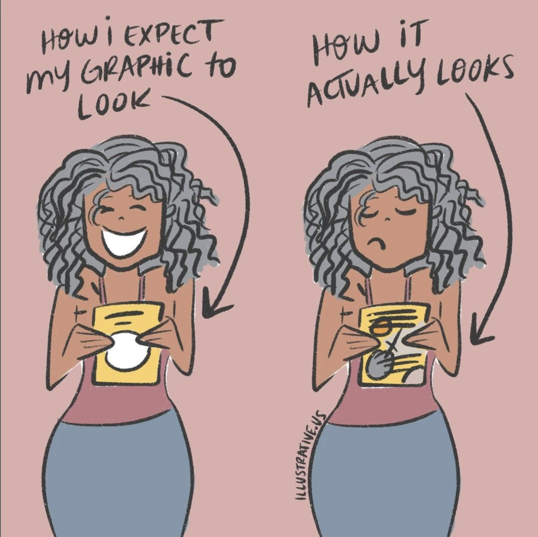
In the image on the left the “space train” can move easily around the words and image without getting stuck. In the image on the right there are too many places where information overlaps which makes it less readable.
Leave the Edges clear. This means, make sure you have space around the edge of your designs. Don’t have vital text and information running off the outside of the design. People need to see important information quickly to keep their attention.
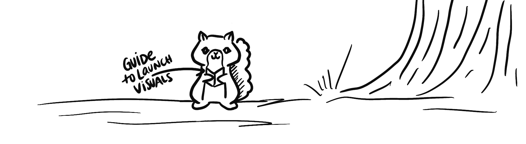
Pretend like you have a little train going through your visual’s empty space and make sure it has a clear path to travel.

The purple line in a Canva document shows you what text will print well and what is too close to the line for printing. This is a great guide to use for readability too!
Use the Tools you Have. Online editing tools like Canva allow you to enter text and format it in a much more readable format. You can increase the line spacing between lines, like double spacing them and you can increase the spacing between the letters. The purple outlines show where the text needs to stay to be readable. Once you try squeezing in more content beyond that line it will start to get chaotic for your reader. You can add another slide if that happens.
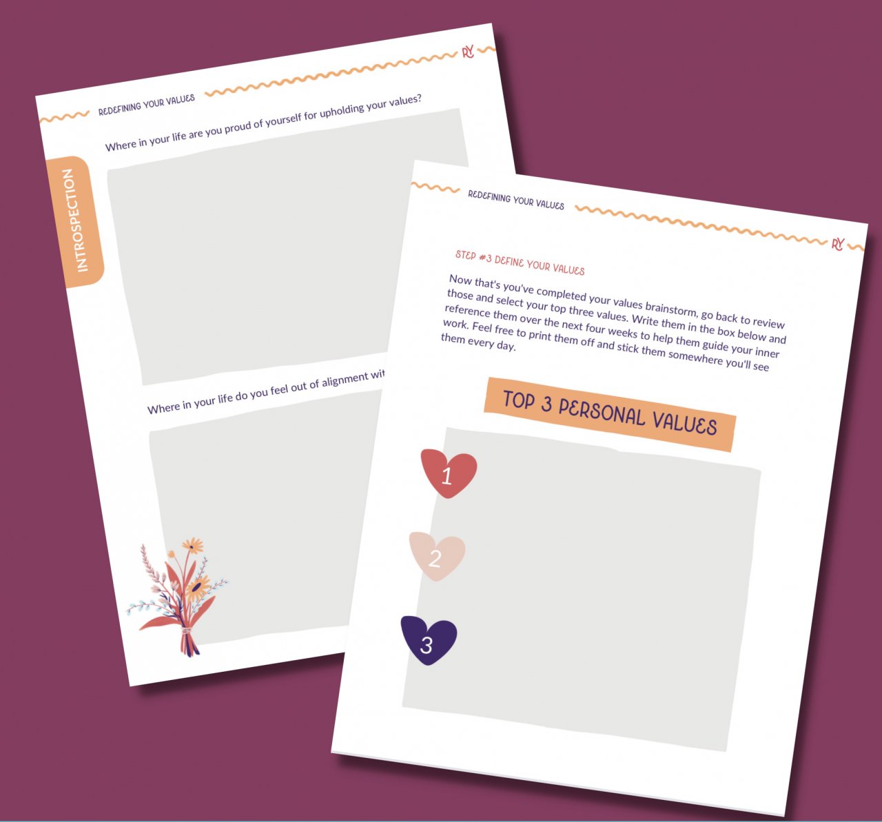
In this workbook page we created large thinking spaces for thoughtful journaling answers rather than small lines or outlined boxes.
Move it to the next slide. By all means, you can and are allowed to space out your designs. Social media platforms usually allow you to post multiple images in one post that gives a slider effect and allows your audience to scroll between posts. And adding extra pages to your workbooks and presentations in the name of spaciousness will only benefit your readers, so no need to cram all your info into one slide.
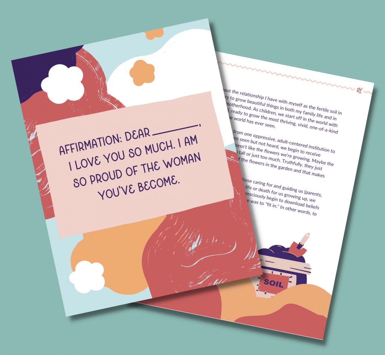
We create an entire page in this workbook for one of the affirmations so that it stood out and created a moment of breathe in the journal
Add Quotes, Graphs or a Title to Create Space. You can sprinkle slides that just have the title, a quote or an important piece of information throughout your presentations to make them feel less heavy to digest. Create simple charts or graphs that show the information that you're talking about. An image provides visual space because it's something different to look at.

Notice how hierarchy in this image is determined by the size of the header font, the bright colors and the use of imagery. Eyes naturally are drawn to big, bold and visual concepts. For screen readers the h1, h2, h3, etc and paragraph settings help determine the hierarchy.
Bolder Can Be Better. Bold text not only showcases your main points, it also breaks information into digestible spacing visually. Think of adding space between your paragraphs by adding a bold header. Making this simple change can make your work easier for people with ADHD to read. The same concept for adding space by using bullet points or numbered lists works wonders because the indentation helps people organize the information much easier and feel less overwhelmed about the amount of information in your text. (It also helps with SEO on your web pages - double bonus!)
Less space means less readability and less chances to pause and digest what someone is reading. Keep your graphics happy by giving them breathe.
Add Whitespace Frames. Lastly, remember, whenever you have a picture or a visual that is very energetic and has a lot going on in the visual, make sure there's whitespace under and above it so that there's a break for the eye of the viewer between reading passages.
These are just a few of the ways to add space and breath to your content. Your content will be much easier to digest and retain for your students, clients, and your audience.


Need more support?
Have questions about this article? Leave a comment below or email me at laura@illustrative.us.

AUTHOR | LAURA MATTESON
Laura is a neurodivergent artist, mother, wife, founder of Illustrative with fancy drawing skills and a huge bucket full of hope for humanity.